Powered By Blogger

Monday 28 February 2011

Analysing Radio Adverts

Unfortunately there wasn't much newspaper radio adverts to find. This made it quite difficult for me to understand or know the codes and conventions needed for a successful newspaper advert. However I felt the absence of these radio adverts means that my newspaper will be unique and original.
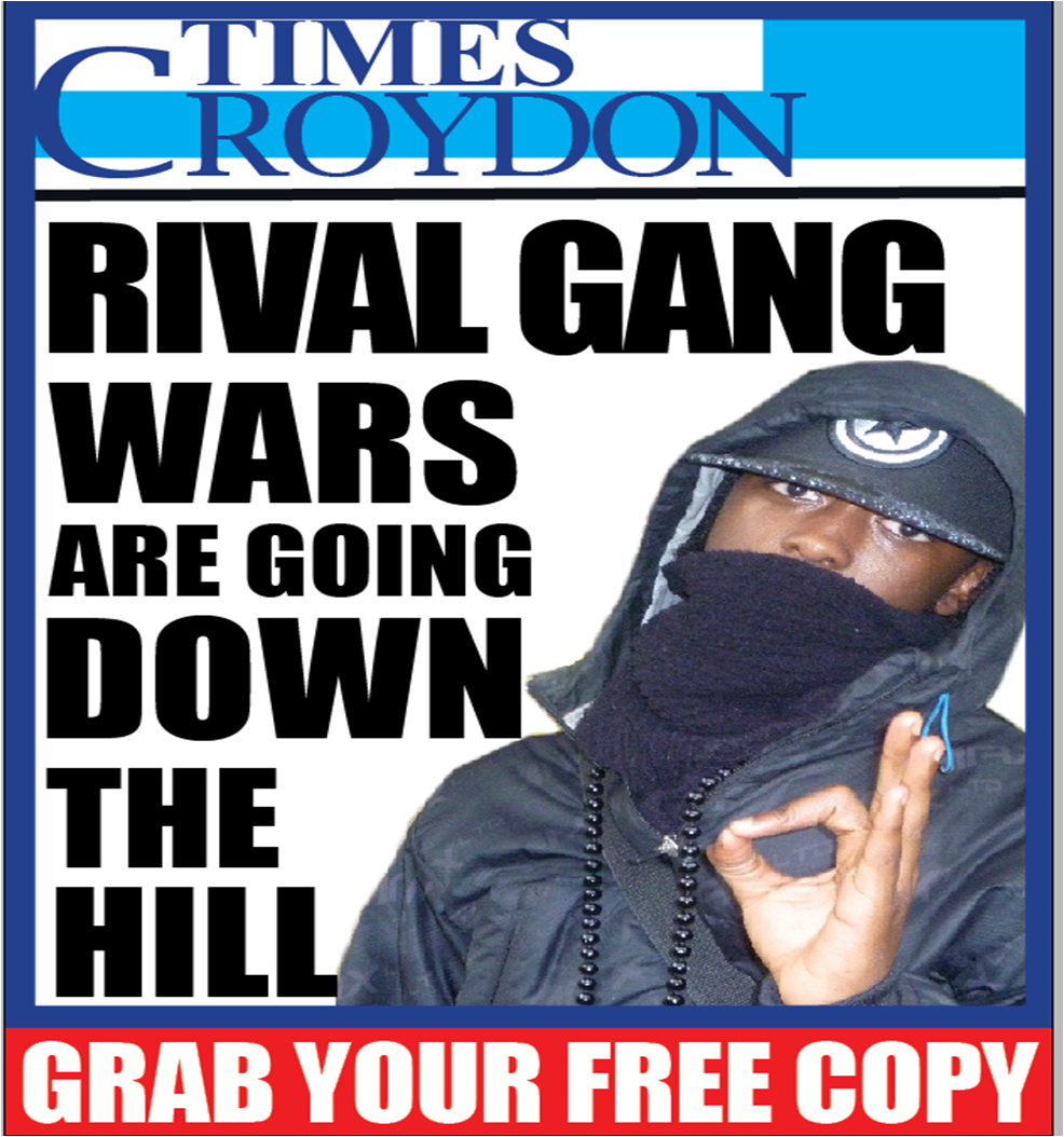
Below is my analysis of the newspaper adverts I managed to find and my opinion towards them.

http://www.youtube.com/watch?v=x7tGHQSe5G4
This is an example of a newspaper radio advert from an A2 media student that I found via YouTube.
I liked the idea of advertising the newspaper firstly as a lottery advert because lottery or anything to do with money in today's society is something which grabs readers attention easily. Am starting to feel as though the saying should be changed to "money sells". I liked the fact that their voice was quite clear especially in the beginning which is good as it means that it would encourage the listener to carry on listening to the end of the advertisement as they can hear and understand what is being said in the beginning. The song choice was really nice and enthusiastic and went well with the script as the character was happy that they won the lottery,  it fitted well with the context. Despite these positive codes present in the advertisement, there were a few things that I personally don't feel worked for me. Firstly, I didn't like the fact that there was no jingle all throughout the advert until the end, I felt this was not beneficial in promoting the newspaper because it made the advert appear quite dull and fatigue and this makes the audience/ listeners tune out. Also although they spoke clear in the beginning of the advertisement I noticed that all throughout they spoke quite fast, which made it difficult for listeners to hear or understand what is being said. Their tone of voice was at the same pitch/ level all throughout even when they found out they had won the lottery. This I felt made it quite armature and draining to listen to,  as I felt the emotion in their voice wasn't real which made it less persuading for me as an audience to buy the paper.
Overall I didn't like the advert however I felt through this analysis I managed to find out what works and what doesn't work. For example in terms of why I think they should have played the jingle all throughout is because the effect of the jingle is to "spice" up the advertisement and also to remind the audience of the advert each time they hear it. Personally I feel having a jingle all throughout the advert is important because the jingle acts like a nameplate. The same way you identify a newspaper due to the nameplate, you identify a product with it's jingle or slogan. For example every time you hear the slogan "Feel Like Sunday" you immediately think about the Sunday Mail.
Secondly, although they spoke fast to show their excitement of getting hold of the newspaper, I felt it wasn't done effectively because it wasn't clear. One of the disadvantages of radio adverts in comparison to web pages is that you cannot re-read what has been said so you only have one chance to understand or make sense of what is being said. So it has to be clear enough the first time. I felt there wasn't enough emphasis on the name of the newspaper. It almost muddled up with his other lines and was not clear enough as to what the name of the newspaper was.  Finally it did not inform the readers when the newspaper would be out, where we can get it or how much. I feel this information is vital in promoting consumerism because if the listener is actually drawn in by the advert to purchase the newspaper, they will not be able to do so due to the lack of knowledge of where they can get it from.

http://www.youtube.com/watch?v=bfBPDOeY__U
This is the second data I will be analysing. This is also a newspaper advert. Although it is not for radio, but rather for T.V. I still feel it is worth knowing about the different codes and conventions between them both and I also felt I could acquire a lot of information by analysing a T.V. newspaper advert. Although the newspaper being advertised is different to what my newspaper features and what it's pleasures are. What I like about this advert is the fact that there is no talking/ dialogue within it and makes the most of the visual aspect of television. It engages the audience through the humour within the storyline about a woman and man who find each other attractive etc, a situation that most of the target audience would be familiar with. The fact that the advert manages to trick the audience in the beginning and then finally advertises the newspaper towards the end  is really effective as they would be drawn in so much by the advert that it would stop them from "tuning out". The use of the closeup shot of the nameplate of the newspaper stood out and became more familiar to the audience thus persuading them to purchase it. I also liked the use of the jingle all throughout the advert because it felt as though it was telling the story and also stuck in my mind for quite a bit which immediately reminded me of the newspaper.Overall I really like this advert because it is aesthetically pleasing to watch and listen to and  not only this it uses humour in a good way to grab the viewers attention.

Friday 18 February 2011

After receiving the results from my questionnaire. I myself deconstructed my poster saying the effects of the decisions I made.

Thursday 17 February 2011

ANCILARY PROJECT 2

This week I will be researching on radio adverts and learning more about the codes needed to make a successful radio advert, which effectively advertise my newspaper. I decided to do a radio advert because I wanted both visual (poster) and aural (radio) sources which will effectively advertise my newspaper and persuade my readers to read the newspaper thus promoting consumerism. I also noticed from my own personal experience and from my research that “radio is very effective as an outreach medium". This means that radio is the best way to advertise or "reach" a product to your audience. Radio ads can take your product to all over the world so rapid publicity is possible. This is what I intend to do.Along with this, I found out that "Radio ads can take your product to all over the world so rapid publicity is possible."
Read more at http://www.articlealley.com/article_886114_48.html?ktrack=kcplink

Although this is not essential in helping my newspaper well known and entertaining for it's target audience as it is a local newspaper and not a national or global newspaper, I still felt I would be happy to at least know my newspaper attracts diverse audience.
http://www.rab.co.uk/rab2009/showContent.aspx?id=1200
When undergoing my research, I noticed that there wasn’t a lot of radio adverts present as most local newspapers had web-pages and the minority used newspaper posters to advertise the newspaper. I felt the reason why web-pages are used the most to advertise newspapers, is due to the growth in technology and the fact that most people and areas have access to the Internet. Not only this but most web pages such as Hackney Gazette allow their audience to get hold of soft copies of the newspaper via the web-page and all the old archives/ editions which means that the readers would still be able to retrieve any edition they have missed. However, due to the scientific research that claims that "sound travels faster than light" meaning we hear things before we see them, I decided to do a radio advert because I felt it is easier to absorb information when it is heard than when it is written especially when it is done so with a jingle in the background. :-)
After deciding what ancillary project I would like to do, I began my research. My research encouraged me to do the radio advert because I found out that “One of the most competitive media in your local market is radio".  This means that by advertising my newspaper via the radio, I have a higher chance of getting hold of my target audience and more diverse audience and most importantly, am guaranteed to effectively promote my newspaper and get them into buying the newspaper. 

One of the information I found out from my research is that, according to the radio advertising “Bureau”, “75% of all people listen to the radio daily. This does not mean they listen all day, every day. It simply means that 75% of the people have the radio on at some point during the day. They may listen for 5 minutes or 5 hours, but certainly they are not all listening all the time all day long. If you are feeling generous, you can reasonably assume that 40% of the households in your market have the radio on at the peak time of the day. “From this I decided that considering my newspaper is new in the market, I will be advertising my newspaper in the morning because that is the peak time of the day when everyone has the radio on. I also found out that most consumers admit that they “have the radio on simply for background noise”. This encouraged me to ensure that my advert is very energetic so it grabs the listener’s attention even if the radio is on, just for background noise. Along with this, listeners of the radio hate commercials as they only listen to the radio for music and news, and feel commercials interrupt this so having an energetic radio advert means that their interest level will be kept thus persuading them to listen and get hold of the paper.  As you know “radio advertising simply can't reach the number of consumers your paper can provide every week”. So I will make use of the amount of listeners/ audience this advertisement will attract.
The graph below explain that radio dominates a third of the media, so it is defiantly a good source to use in advertising my newspaper.


Improving my Ancilary

Again, after the feedback from my first attempt on the poster. I used the feedback I received from my audience and tried to improve my poster in order to make it appealing to my target audience. After doing so, using the same questionnaire from the previous one. I asked my demographic what they think of the new version. Below are the results I received. Again I have written why the audience said what they said and what action I will be taking if any to make it better.
29 people liked this poster , and 11 people didn't like it as much. For those that said they didn't like it, they did say it has improved greatly in comparison to the previous one but it is still lacking something. Further questions in this questionnaire gave them an  opportunity to make their point.

 
 I was quite impressed in particular from the result I received from this question, because the results I received from my previous questionnaire showed a mixture of feelings toward the layout. There were people who were fond of the layout following generic conventions and others who preferred for me to challenge normal conventions.  The results from my questionnaire showed a great improvement in my capacity to meet the needs of my audience.  For the 25 people who liked the layout , they felt the layout was effective because a hierarchy was created within the position of each component, they liked the new position of the nameplate as it meant they could easily recognise the newspaper itself.  Although the headline was not the biggest on the page, the position of it meant that it was the most dominant on the page. They felt that although it didn’t follow generic conventions, it still fulfilled is purpose which is to grab the audience attention and promote/ advertise the newspaper. The headline they felt was quite different which was effective as it stood out from the page. Along with this they liked the fact that a decent amount of space on the page was devoted to the headline and liked the different font sizes used as it only highlighted key words within the headline, thus giving it more of a balance as it appeared as though less writing was used on the page. They also liked the position of the picture and the amount of space that I devoted to it. Unfortunately, for the 12 people that felt the layout was okay, they couldn't give a concrete reason as to why it was okay. They felt although it effectively challenged media conventions, they were used to the generic conventions of newspaper posters and felt it was easier to stick to it. However, I personally feel that it does follow generic conventions because components such as the nameplate and headline are still Incorporated into it and a picture has only been added to grab the audience attention  more and make the poster aesthetically engaging and pleasing.
 
The results for this stayed the same. But their opinions towards it differ. Again, 28 people liked the colour scheme of this poster because they felt the colours again connotes well with the mise en scene of the image in terms of “costume”. They liked the fact that the boarder was made thicker as it distinguished it from the newspaper it self and made the elements inside the poster i.e. nameplate, headline stand out. The continuous colour scheme that ran through the page they felt made it look simple and easy to understand and read. They liked the structure of the poster because everything looked as though it was meant to be placed in the section it has been put in. It doesn’t look cramped and this is emphasized by the different font size used for   the headline. They liked the colour added on the slogan at the bottom to draw more attention to when the audience can get hold of the newspaper. For the 12 people  that didn’t like it they felt that the colour should be changed to something more vibrant. However after continuous experiment with this, I decided not to add a vibrant colour to the poster because it didn't look appealing,  and didn't go well with the colour scheme that ran through the other components. I felt if I added a vibrant colour to the page it would confuse the audience .  However feedback from my teacher who also falls into my target audience also suggested I add the colour red to the poster as not only does it emphasise on the poster as it would draw the readers attention to it immediately and make it stand out but it would be more appealing to my target audience and that is my aim.  Below is the changes of my new poster.


Again making changes to my poster in order to make it appealing for my audience, 22 people felt it followed normal conventions of the limited edition of newspaper posters they have seen as it has all the components which distinguishes it from the actual newspaper itself and an example for this alone is the layout. On a front page of a newspaper, the section which tells the audience when they can get hold of the newspaper will be find in the dateline which is right at the top, in contrast to the position of it on the poster. There are those who felt it effectively challenged conventions of generic posters because it had a picture on it, which effectively drew their attention to it. Along with this, the different font sizes used on the headline to emphasise on key words created a hierarchy on the page, making the headline the second significant component on the poster. 8 people felt it was not effective because they felt the addition of an image took away the codes and conventions expected on a poster and they felt this wasn’t a good look for a new newspaper.  For those who felt the poster was effective said, the aim of a poster is to draw  readers attention and this does so. They felt the fact that the poster challenged normal conventions of posters made the newspaper appear unique, fresh and diverse. I am quite happy with the results actually.


As you can see 30 people liked the fact that a different headline has been used on the poster because that was the headline I used on my front page, so the fact that I used the same headline on the poster means the two components are linked well together. This headline also would attract many more audiences. As you know my newspaper is aimed at adults, parents and elderly people in the neighbourhood however I feel this headline will appeal to teenagers in the borough. It correlated well with the picture due to the cross reference of the picture to the headline .


After my previous questionnaire, I found out that many people wanted me to have a picture on the page.  I decided to go along with this idea to experiment  with this, to see the effect a picture has on a poster and most importantly attracting the audience. Many of my audience liked the picture on the front page because not only did it draw their attention immediately even from a long distance, it correlated well with the headline, and  the image stemmed from a stereotype which is familiar to the audience.  The race of the model to the costume in which he was dressed in (mise en scene) to the way in which he ha been posed/ positioned (gang sign with hands) has a strong link with the headline .


An impressive 28 people said they would not like anything else a they can see I have used the result from my previous questionnaire very wisely, to put together a very  detailed and persuasive  poster. However 12 people said they felt a vibrant colour is needed on the page.  I again went back to experiment and found that, if I put another colour on to the page, it would be quite hard to link all 3 component together, it would be heavy on the eye considering  the different components present on the page. So I will not be putting a vibrant colour on the page.

Monday 14 February 2011

My first attempt on the ancilary task 1feedback

After doing questionnaire concerning what layout my audience would like me to use for the poster. I began constructing. Bearing in my mind all the components of a newspaper poster and the purpose of each component. After making my poster I gave them out to my audience asking them what they thought about it. Below are results of the questionnaire I gave out to 40 people that fall within my target audience. Using microsoft excel I put them into a graph, and wrote for each question the reason behind the results I achieved.
25 people out of 40 did not like this poster . With this at hand I decided to ask them why they liked and didn't like the poster.
 3 people liked the layout of the poster because they felt it followed generic conventions of the minimum amount of newspaper posters out there, and felt by doing this it made it look more professional than authentic . For the 11 people that thought the layout was okay, they liked the fact that it had the nameplate at the bottom and the headline on top, because it meant the readers will be drawn in by the headline, as most people would probably not look at the poster if they see the newspaper first as they don't recognise it. However they didn't like the simplicity of the layout and felt  it doesn't have to follow generic conventions to achieve it's purpose. For the shocking 26 people that didn't like this poster, they felt the position of the nameplate was not smart as the nameplate should be at the top that way even if the readers were drawn in mainly by the headline, they will find it easier to recognize the actual newspaper as they will recognise the nameplate from the poster. Finally they felt that the headline seems to take up too much space. They said it can still grab the audience attention even if it is small depending on how  I lay it out or present it. With this in mind I have decided to consider how much space I would like to devote to my headline, which position is best for my nameplate to be and how to make the poster less simple but still professional.
An impressive 28 people liked the colour scheme that ran through the poster as they felt it correlated well with both the front page and the inside page. They liked the fact that a darker colour was used in contrast to the bright blue used for the nameplate as it meant the nameplate stood out from the page and then immediately created an hierarchy within the poster. For the 12 people that didn't like the colour scheme they felt that it needed at least one or two really bright colours which will draw the audience attention from far.  From this result I will be considering  which bright colour i will be using on the poster and where it will be used

From the results  I noticed that 22 people said  yes the poster followed normal conventions of newspaper poster as it has all the components  of a newspaper poster such as a:  headline, nameplate , bold  large fonts, ongoing colour scheme etc.  and for the 18 people that felt it doesn't follow normal conventions was based on the fact that it doesn't fulfill is function/ purpose as to advertise the newspaper and to encourage people to read it. The 28 people that felt it was effective said that it was because the more it looked similar to normal conventions the more people would be drawn  to getting involved and reading it.  The 12 people that didn't think it was effective was because they felt that because it is a new newspaper, the advertisement for it should be different so it can stand out from the rest of the local newspapers, thus promoting consumerism for the newspaper.

 
As you can see 15 people felt the headline being advertised on the poster was effective enough to draw the target audience into reading the newspaper. The headline is based centred around a family in the borough, this was effective as the paper is aimed at families/ parents so they would be able to relate to it. It follows journalistic style, by using alliteration to engage the audience, and they felt this was effective.
25 people  felt it was not effective because they wanted the poster to advertise the major headline, because that way it would make it easier for the audience to recognise the newspaper and also because it would follow normal conventions of other newspaper posters thus making it more authentic and professional.
 
30 people said they wanted to see a picture on the poster because they felt pictures grab every one's attention more in contrast to text. They felt if there was a picture on the poster it would make it stand out more and would help the audience distinguish it from other local newspaper posters as  most of them do not have such components.  For the 10 people that felt that the poster didn't need a picture it was because they felt  although it did attract the audience  more and made the poster more aesthetically pleasing, they felt it should follow normal conventions  of newspaper posters and not try and challenge them, especially when it's new.

A shocking  39 people said they would like something added to the poster to make it more presentable and for it to effectively fulfill is function.  Most people said their main concern was the fact that it was not visually attractive enough to encourage people to read it. So they suggested that at least one or two vibrant colours aside from blue should  be used on the page and a slogan which states when the newspaper comes out , or how often it comes out (issue date).  So I will be putting  all of this feedback  into consideration when constructing another poster.

FEEDBACK FROM PRESENTATION

I showed those in my class my presentation in which I explained to them what I have been doing since the last time I did it. I did my presentation on the eleventh of January. I got really good feedback from my teacher who gave me an A for the components of my local newspaper saying “Excellent work produced, very impressive standard of work” an A- for my presentation components (I was quite shy) saying “confident/ detailed knowledge of work produced” and a C+ for the components in my blog and evaluation saying “very good progress being made.  Overall she said my newspaper looked better that the “real one”. In terms of hat constructive criticism I was given, she said I should try and do something more with my ancillary  task 1 which is my newspaper poster. I’ve decided to do a questionnaire based on what my audience would like on the poster, the layout and anything else they feel is needed to enhance the newspaper poster to attract them and others.