

Again, after the feedback from my first attempt on the poster. I used the feedback I received from my audience and tried to improve my poster in order to make it appealing to my target audience. After doing so, using the same questionnaire from the previous one. I asked my demographic what they think of the new version. Below are the results I received. Again I have written why the audience said what they said and what action I will be taking if any to make it better.

29 people liked this poster , and 11 people didn't like it as much. For those that said they didn't like it, they did say it has improved greatly in comparison to the previous one but it is still lacking something. Further questions in this questionnaire gave them an opportunity to make their point.

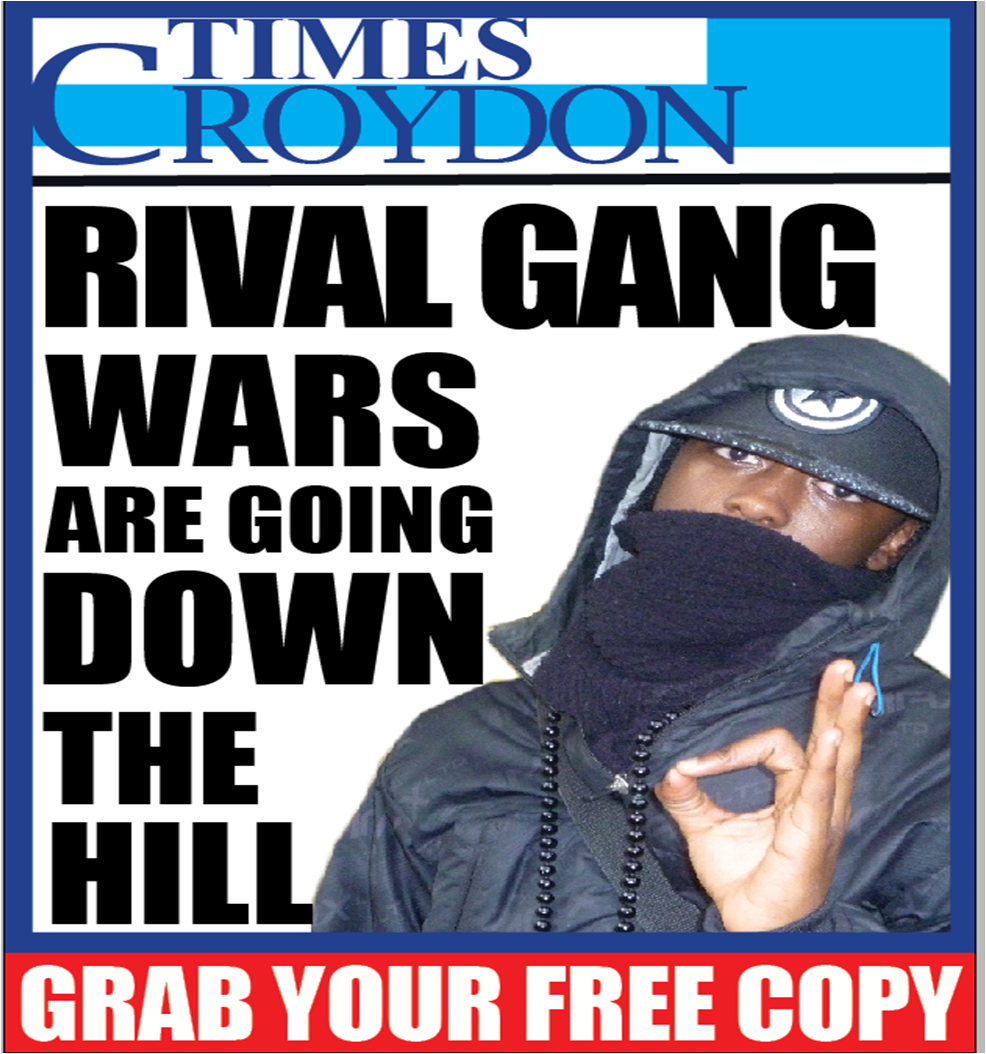
I was quite impressed in particular from the result I received from this question, because the results I received from my previous questionnaire showed a mixture of feelings toward the layout. There were people who were fond of the layout following generic conventions and others who preferred for me to challenge normal conventions. The results from my questionnaire showed a great improvement in my capacity to meet the needs of my audience. For the 25 people who liked the layout , they felt the layout was effective because a hierarchy was created within the position of each component, they liked the new position of the nameplate as it meant they could easily recognise the newspaper itself. Although the headline was not the biggest on the page, the position of it meant that it was the most dominant on the page. They felt that although it didn’t follow generic conventions, it still fulfilled is purpose which is to grab the audience attention and promote/ advertise the newspaper. The headline they felt was quite different which was effective as it stood out from the page. Along with this they liked the fact that a decent amount of space on the page was devoted to the headline and liked the different font sizes used as it only highlighted key words within the headline, thus giving it more of a balance as it appeared as though less writing was used on the page. They also liked the position of the picture and the amount of space that I devoted to it. Unfortunately, for the 12 people that felt the layout was okay, they couldn't give a concrete reason as to why it was okay. They felt although it effectively challenged media conventions, they were used to the generic conventions of newspaper posters and felt it was easier to stick to it. However, I personally feel that it does follow generic conventions because components such as the nameplate and headline are still Incorporated into it and a picture has only been added to grab the audience attention more and make the poster aesthetically engaging and pleasing.

The results for this stayed the same. But their opinions towards it differ. Again, 28 people liked the colour scheme of this poster because they felt the colours again connotes well with the mise en scene of the image in terms of “costume”. They liked the fact that the boarder was made thicker as it distinguished it from the newspaper it self and made the elements inside the poster i.e. nameplate, headline stand out. The continuous colour scheme that ran through the page they felt made it look simple and easy to understand and read. They liked the structure of the poster because everything looked as though it was meant to be placed in the section it has been put in. It doesn’t look cramped and this is emphasized by the different font size used for the headline. They liked the colour added on the slogan at the bottom to draw more attention to when the audience can get hold of the newspaper. For the 12 people that didn’t like it they felt that the colour should be changed to something more vibrant. However after continuous experiment with this, I decided not to add a vibrant colour to the poster because it didn't look appealing, and didn't go well with the colour scheme that ran through the other components. I felt if I added a vibrant colour to the page it would confuse the audience . However feedback from my teacher who also falls into my target audience also suggested I add the colour red to the poster as not only does it emphasise on the poster as it would draw the readers attention to it immediately and make it stand out but it would be more appealing to my target audience and that is my aim. Below is the changes of my new poster.

Again making changes to my poster in order to make it appealing for my audience, 22 people felt it followed normal conventions of the limited edition of newspaper posters they have seen as it has all the components which distinguishes it from the actual newspaper itself and an example for this alone is the layout. On a front page of a newspaper, the section which tells the audience when they can get hold of the newspaper will be find in the dateline which is right at the top, in contrast to the position of it on the poster. There are those who felt it effectively challenged conventions of generic posters because it had a picture on it, which effectively drew their attention to it. Along with this, the different font sizes used on the headline to emphasise on key words created a hierarchy on the page, making the headline the second significant component on the poster. 8 people felt it was not effective because they felt the addition of an image took away the codes and conventions expected on a poster and they felt this wasn’t a good look for a new newspaper. For those who felt the poster was effective said, the aim of a poster is to draw readers attention and this does so. They felt the fact that the poster challenged normal conventions of posters made the newspaper appear unique, fresh and diverse. I am quite happy with the results actually.

As you can see 30 people liked the fact that a different headline has been used on the poster because that was the headline I used on my front page, so the fact that I used the same headline on the poster means the two components are linked well together. This headline also would attract many more audiences. As you know my newspaper is aimed at adults, parents and elderly people in the neighbourhood however I feel this headline will appeal to teenagers in the borough. It correlated well with the picture due to the cross reference of the picture to the headline .

After my previous questionnaire, I found out that many people wanted me to have a picture on the page. I decided to go along with this idea to experiment with this, to see the effect a picture has on a poster and most importantly attracting the audience. Many of my audience liked the picture on the front page because not only did it draw their attention immediately even from a long distance, it correlated well with the headline, and the image stemmed from a stereotype which is familiar to the audience. The race of the model to the costume in which he was dressed in (mise en scene) to the way in which he ha been posed/ positioned (gang sign with hands) has a strong link with the headline .

An impressive 28 people said they would not like anything else a they can see I have used the result from my previous questionnaire very wisely, to put together a very detailed and persuasive poster. However 12 people said they felt a vibrant colour is needed on the page. I again went back to experiment and found that, if I put another colour on to the page, it would be quite hard to link all 3 component together, it would be heavy on the eye considering the different components present on the page. So I will not be putting a vibrant colour on the page.
No comments:
Post a Comment