This was the first nameplate I produced before researching about my Local newspapers. I decided to have a teaser at the side of my nameplate because i liked the idea of giving the readers a taste if what will be in the newspaper and i feel the position in which i placed it (near the nameplate) would attract people to buy the newspaper. After my research I noticed that the name of my newspaper alone was not appropriate as it would be difficult to identify by my target audience. Along with this, i noticed the colour red and black was very strong on the readers eyes and was not very welcoming in terms of who it is aimed at. I aim to attract parents and elderly people and the colour red has negative connotations such as danger and although it's very bright and so will grab their immediate attention it is not very friendly. Not only that but the colour red does not represent Croydon. So i will defiantly be changing this.
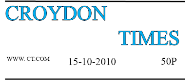
Above is a print screen of my nameplate i produced on Adobe Indesign after my research. I prefer the nameplate better than the previous one i did because it appears more friendly. As you can see I changed the name of my newspaper to Croydon Times this i felt again was better that Bombay Times because it was easy to identify and reflected the normal conventions of local newspapers. All local newspapers have the name of the borough or Area somewhere on their nameplate example Hackney Gazette, South London Press, Croydon Guardian and I felt following this convention will help in the success of my newspaper. I spaced out the Croydon Times because I wanted my nameplate to take up the whole section i have dedicated to it and then added a black outline as it stood out more and I felt this would attract the audience more. Although throughout my research i found out that the price of most local newspapers where around £0.00-£0.40p i still chose to make my newspaper £0.50p because i felt those prices where cheap and wanted to challenge the media conventions. The font i used for this was Times New Roman, i used this because I felt it was simple and would attract my audience.
Above is a print screen of my nameplate which i produced using Adobe Indesign. Although i was satisfied with my previous nameplate, I felt it wasn't attractive enough. I liked the fact that it was simplistic and this was the style i was going for and still is going for, I felt it needed something because it was too plain and there was too much space. So keeping the name of my newspaper, i decided to produce another nameplate using the same software (In design) but this time referring to my questionnaire for guidance. My questionnaire showed that 26 people were attracted to nameplates that used different font sizes for each part of the name. So i began designing my nameplate that i felt would be suitable and attractive to my target audience. I chose the font Lucida Bright because I felt it was more appropriate, easy to read and clear thus grabbing my audience attention. I stuck with the colour blue but this time went for a darker blue because through out my research i noticed that both Croydon Guardian and Croydon Advertiser used these colours, along with this I felt blue is a colour that represented Croydon and also the Whitgift centre, the shopping centre which Croydon is known for is written in blue so i felt the colour resembled this. I then added a stripe and a block of light blue on the nameplate which I placed behind the name of the newspaper, i did this because the name of the newspaper was in a darker blue which i felt looked dull by itself. So this triggered me to add a brighter blue along with this in order for my nameplate to stand out. This looked friendly and welcoming thus attracting my target audience. Along with this it took care of the empty gaps which was there before I added it in as shown below. The simplicity and the balance of the bright and dull colours ensured that it wasn't too heavy on the eyes of the readers. Also I changed the price of my newspaper this was due to the results of my questionnaire which showed 16 people wanted it for 20p where sold. I also added a website in which they can go on for a soft copy of the newspaper.
Above is a table which I constructed using PowerPoint to show how my nameplate follows and challenges media conventions.


No comments:
Post a Comment